Ever wondered why some logos instantly grab your attention while others seem to fade into the background? Enter the captivating world of neuromarketing and color psychology. Let’s dive into the art and science of choosing colors for your logo and branding that resonate with your audience and leave a lasting impression!
Understanding the Neuromarketing Power of Color:
In the realm of branding, color isn’t just about aesthetics – it’s a powerful tool that taps into our emotions, influences perceptions, and drives decision-making. Neuromarketing explores how our brains respond to visual stimuli, and colors play a starring role in shaping those responses.
Tips for Choosing the Right Colors:
1. Know Your Audience:
- Consider your target audience’s demographics, preferences, and cultural background.
- Different age groups, genders, and cultures may interpret colors differently.
2. Reflect Brand Personality:
- Define your brand’s personality – is it bold and energetic or calm and sophisticated?
- Choose colors that align with the emotions and traits you want your brand to convey.
3. Primary Color Meanings:
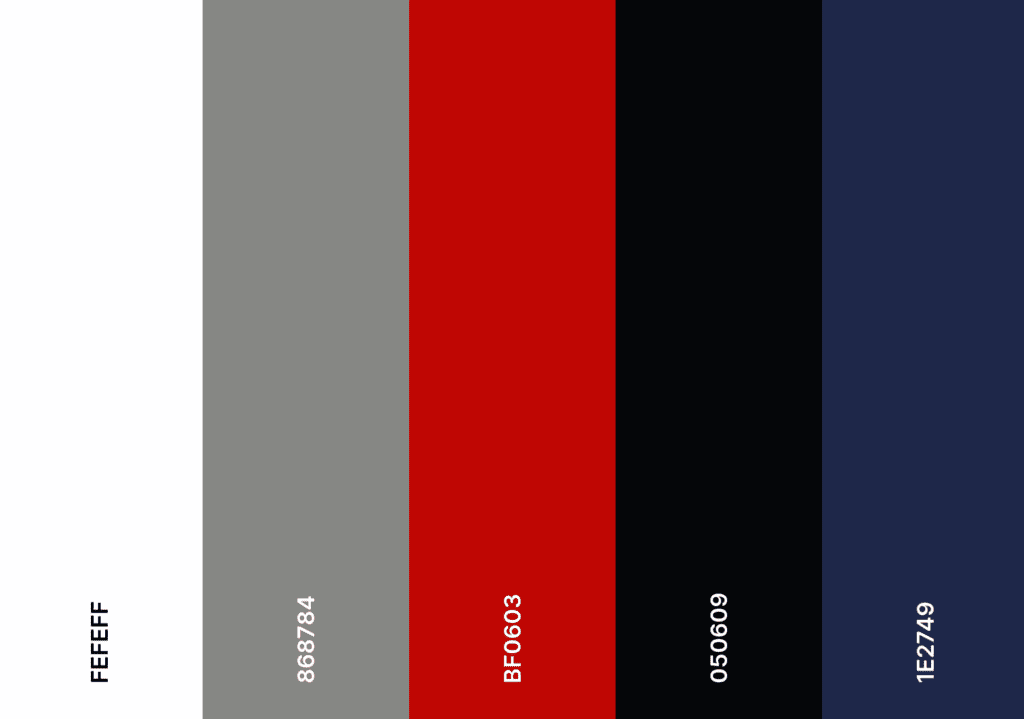
Red:
Meaning: Passion, energy, excitement.
When to Use It: Ideal for brands aiming to evoke strong emotions. Commonly used in industries related to food, fashion, and technology.
How to Use It: Use red strategically to highlight key elements, create urgency, or draw attention. Be cautious with its overuse, as it can be visually overwhelming.
Common Mistakes: Overusing red may create a sense of chaos. Ensure a balanced use of this vibrant color to maintain visual harmony.
Blue:
Meaning: Trust, calmness, professionalism.
When to Use It: Suitable for corporate brands, tech companies, and industries where trust and reliability are paramount.
How to Use It: Use blue as a dominant color for a calming effect. Combine with contrasting colors for visual interest.
Common Mistakes: Neglecting the potential for creative expression. While blue is often associated with professionalism, it doesn’t mean your brand can’t be innovative and dynamic.
Yellow:
Meaning: Optimism, warmth, positivity.
When to Use It: Perfect for brands in the hospitality, wellness, or education sectors. Evokes a sense of friendliness and approachability.
How to Use It: Utilize yellow to highlight key information, evoke a positive mood, or create a cheerful brand identity.
Common Mistakes: Using too much yellow may become visually overwhelming. Balance with neutral tones and other accent colors for a harmonious design.
Green:
Meaning: Nature, growth, health.
When to Use It: Ideal for eco-friendly brands, health-related products, and outdoor or recreational industries.
How to Use It: Incorporate green to convey a sense of freshness and environmental consciousness. Combine with earthy tones for a natural look.
Common Mistakes: Using an inappropriate shade of green can lead to misinterpretation. Ensure the chosen green aligns with your brand message.
Purple:
Meaning: Luxury, creativity, sophistication.
When to Use It: Suited for high-end brands, beauty products, or creative industries. Conjures feelings of elegance and uniqueness.
How to Use It: Use purple as an accent color to convey a sense of luxury. Combining it with gold or silver accents enhances sophistication.
Common Mistakes: Overlooking the potential for subtlety. Purple doesn’t always have to be bold; it can be used to add a touch of elegance without overpowering.
Orange:
Meaning: Playfulness, enthusiasm, vitality.
When to Use It: Effective for brands targeting a youthful audience, promoting energy, or operating in the entertainment industry.
How to Use It: Utilize orange to create a vibrant and lively brand identity. It’s a great accent color for calls-to-action.
Common Mistakes: Neglecting the importance of balance. Orange can be overpowering, so use it strategically to maintain a harmonious visual experience.
4.- When Choosing Colors:
- Consider Cultural Meanings: Be aware of cultural associations with colors. For example, white symbolizes purity in Western cultures but is associated with mourning in some Asian cultures.
- Test for Accessibility: Ensure that color choices are accessible to individuals with color vision deficiencies. Aim for sufficient contrast between text and background colors for readability.
- Stay Consistent Across Platforms: Maintain consistency in color usage across various platforms, including your website, social media, and printed materials. Consistent branding builds recognition and trust.
- Seek Professional Advice: If uncertain about color choices, consult with a professional designer. They can provide insights into color psychology, ensuring your choices align with your brand message and target audience.
Best Practices and Recommendations:
1. Limited Color Palette:
- Stick to a limited color palette to avoid overwhelming your audience.
- Two to three colors are often sufficient for a clean and impactful design.
2. Consider Industry Standards:
- Different industries have established color conventions. For example, blue is often associated with finance and trust, while green is popular in the health and eco-friendly sectors.
3. Test for Accessibility:
- Ensure your color choices are accessible to individuals with color vision deficiencies.
- Tools like Color Contrast Analyzers can help assess color readability.
Remember, the magic of color lies in its strategic application. Choose your palette wisely, experiment with combinations, and let your brand shine with the neuromarketing power of color.