
A heritage crest, reimagined for a STEM future.
We redesigned the logo and brand identity for The Galloway School — a private STEM academy in Friendswood, TX — transforming a dated seal into a modern shield that balances faith, academic heritage, and a science-forward future.
The challenge: a dated seal that didn't say "STEM."
The Galloway School's original mark was a traditional circular seal — a gold cross, laurel wreath, and "EST. 1993." Dignified, but it read like a generic emblem and gave no signal of the school's defining identity: a forward-looking STEM academy.
As the school leaned into its science, technology, engineering, and math focus, it needed a mark that communicated innovation and faith together — and that worked everywhere from a website header to a polo shirt to a Friday-night scoreboard.
We redesigned the identity from the ground up: a modern shield, an atomic-orbit motif, and a clean wordmark — keeping the cross at the heart of it all.
From seal to STEM shield.
Same values — faith, academics, heritage — translated into a confident, modern mark.
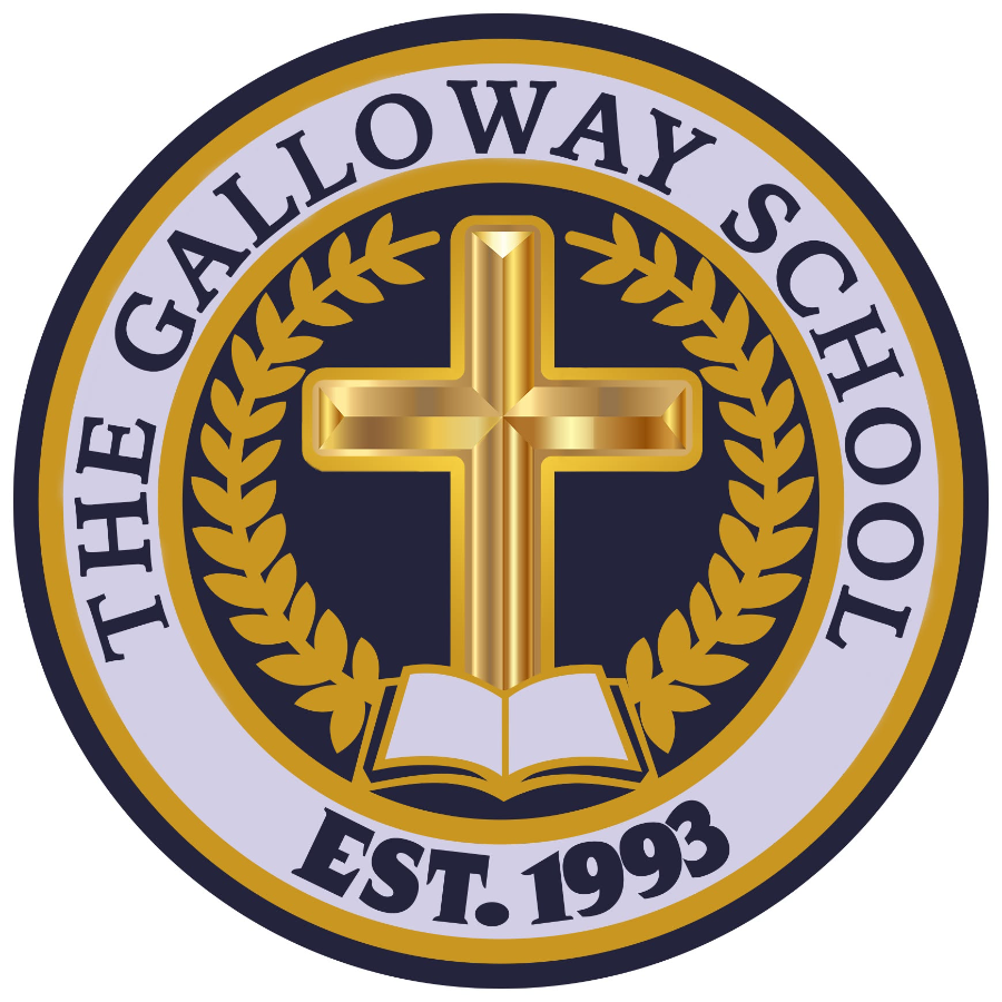
Ornate and gradient-heavy, with no STEM cue — and hard to reproduce cleanly at small sizes.
Flat, scalable, and STEM-forward — with the cross kept at its heart.
Every element earns its place.
- 1The Shield
A modern shield base signals strength, protection, and academic tradition — ownable at any size.
- 2Atomic Orbits
Intersecting orbital paths declare the school's STEM identity at a glance.
- 3The Cross
Centered at the heart of the mark — faith remains the foundation of everything.
- 4Wordmark & Tagline
A clean, geometric wordmark with the curved "A STEM Academy" lockup ties name to mission.
One mark, every surface.
Full-color, one-color, reversed, and on-brand lockups — plus a standalone emblem in every approved color treatment.


Where faith meets science.
Intersecting orbital paths form the heart of the shield — an unmistakable signal of the school's STEM focus.
The cross remains at the literal center — faith stays the foundation, even as the look moves forward.
A shield reads as strength and academic tradition while feeling modern and ownable at any size.
A crisp, legible wordmark with "A STEM Academy" locks up the name and the mission in one move.
A palette with range.
Heritage navy and academic gold anchor the brand, supported by deep navy, mist, and a full set of tints for real-world flexibility across print, web, and apparel.
Clean, geometric, confident.
Set in Montserrat — a modern geometric sans that keeps the brand legible and contemporary across every application.
The brand, in the real world.
Straight from the Galloway brand guidelines — the identity applied across stationery, apparel, and spirit items.
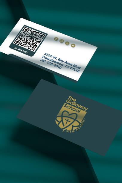 Business Cards
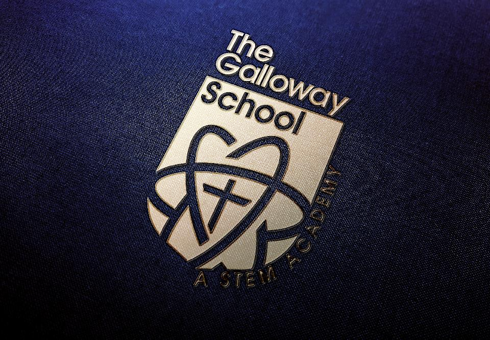 Embossed Mark
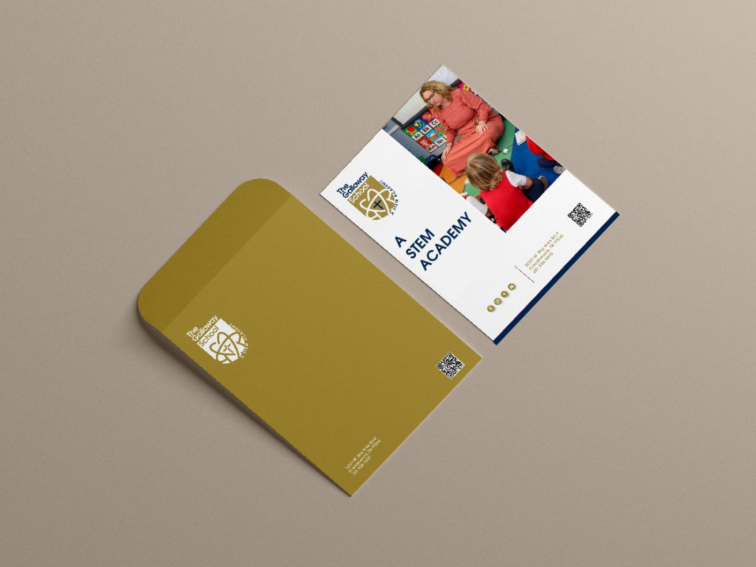 Stationery
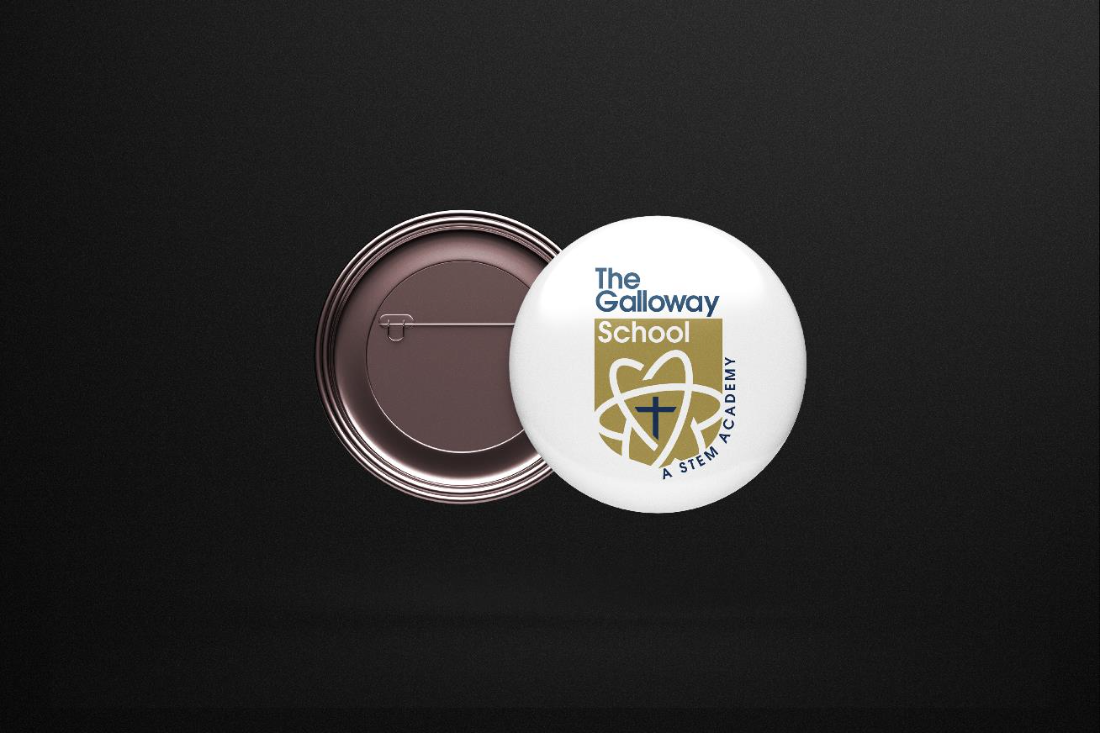 Spirit Pins
Clear space & minimum size.
Simple rules in the brand guide keep the mark crisp and consistent wherever it's used.
Give it room to breathe
Maintain clear space equal to the height of the cross on all sides — no text, graphics, or edges intrude on the mark.
From brief to rollout.
Discovery
We learned the school's values, audience, and the STEM-forward direction driving the rebrand.
Concepts
We explored shield and orbit directions, keeping the cross central to every route.
Refinement
We tuned proportions, color, and the wordmark until the mark worked at every size.
Rollout
We delivered the full logo system, color palette, and usage rules — ready for web, print, and apparel.
A complete identity, not just a logo.
- Primary logo redesign — the STEM shield + wordmark
- Atomic-orbit mark for icons, favicons & spirit wear
- "A STEM Academy" lockup integrated into the identity
- Refined navy + gold color system
- Logo variations for light and dark backgrounds
- Ready for web, print, signage, and apparel
The Galloway School now carries a flexible, modern identity — a STEM-forward shield, a full color system, and logo variations for every surface — rolled out across signage, apparel, stationery, and digital in 2024.