A bold, industrial-strength brand for an aggregate supplier.
We created the brand identity and landing page for Auzterra Aggregates — a confident gold-and-charcoal system with a peak-shaped "A" emblem built to feel as solid and dependable as the materials they supply.
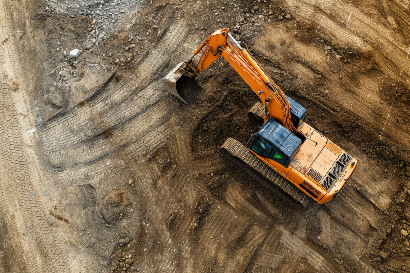
The brief: look as solid as the material.
Aggregates are the literal foundation of construction — but most suppliers in the space look interchangeable and forgettable. Auzterra wanted a brand that signaled strength, reliability, and scale the moment a contractor saw it.
We built a bold wordmark with a custom angular "A" that doubles as a peak — a mountain of material, a marker of quality. Paired with a confident gold and a grounded charcoal, the identity feels industrial and premium at once. Then we brought it to life on a landing page engineered to turn visits into quote requests.
First, we built the brand.
A wordmark, peak emblem, and gold-and-charcoal system built for the field.
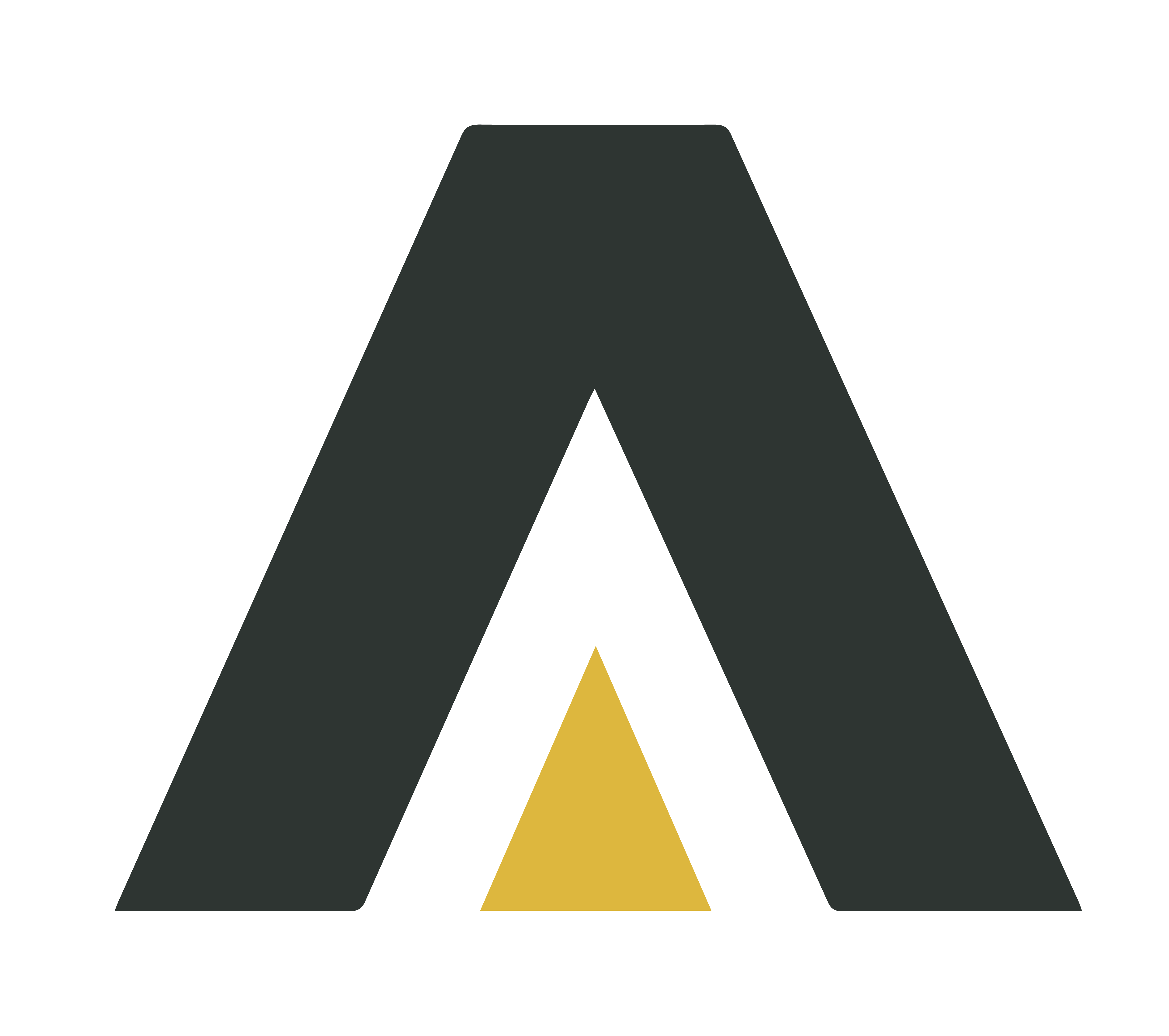
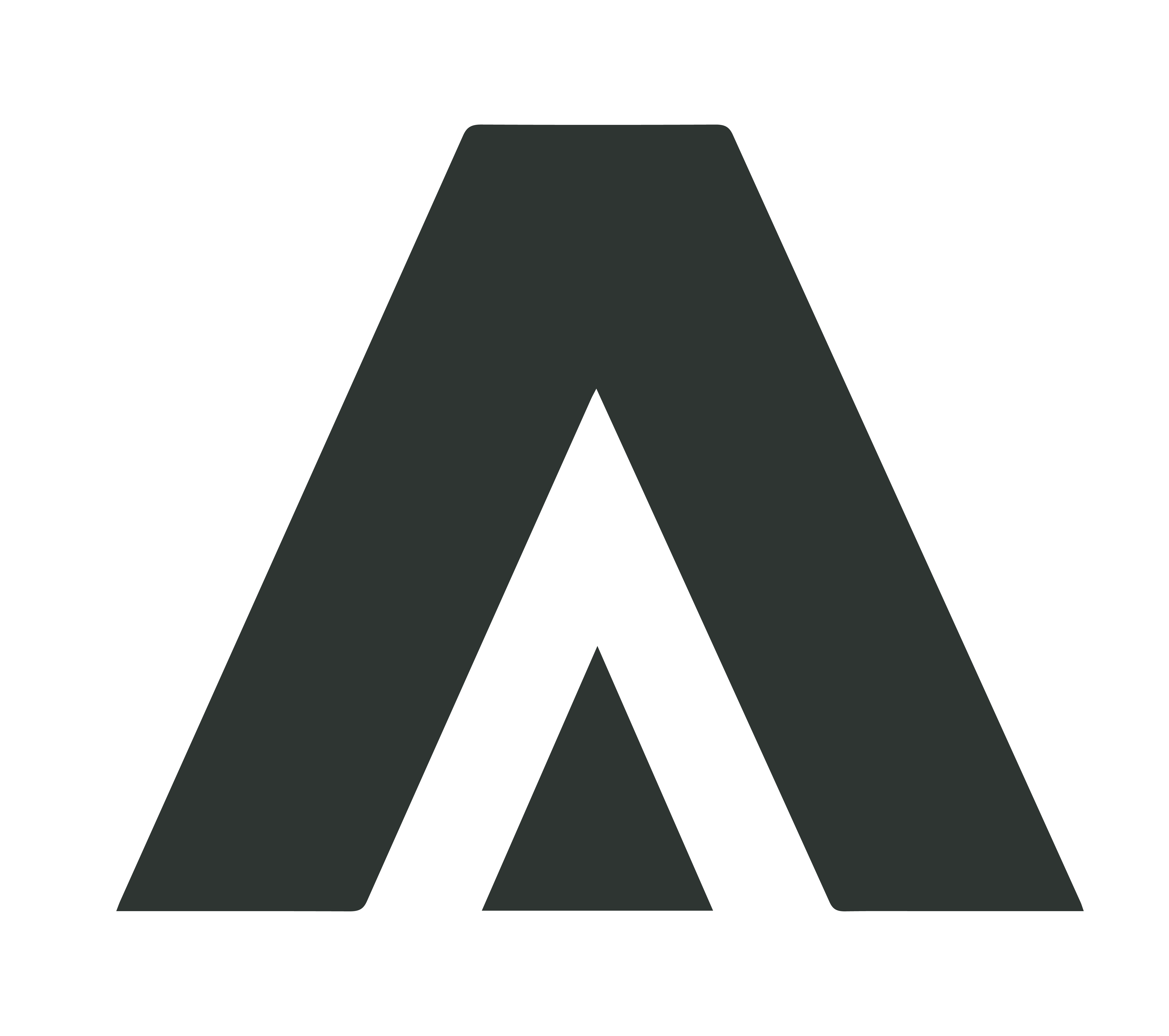
One mark, every surface.
A flexible logo system in gold, charcoal, and reversed — ready for trucks, signage, hi-vis, and screen.
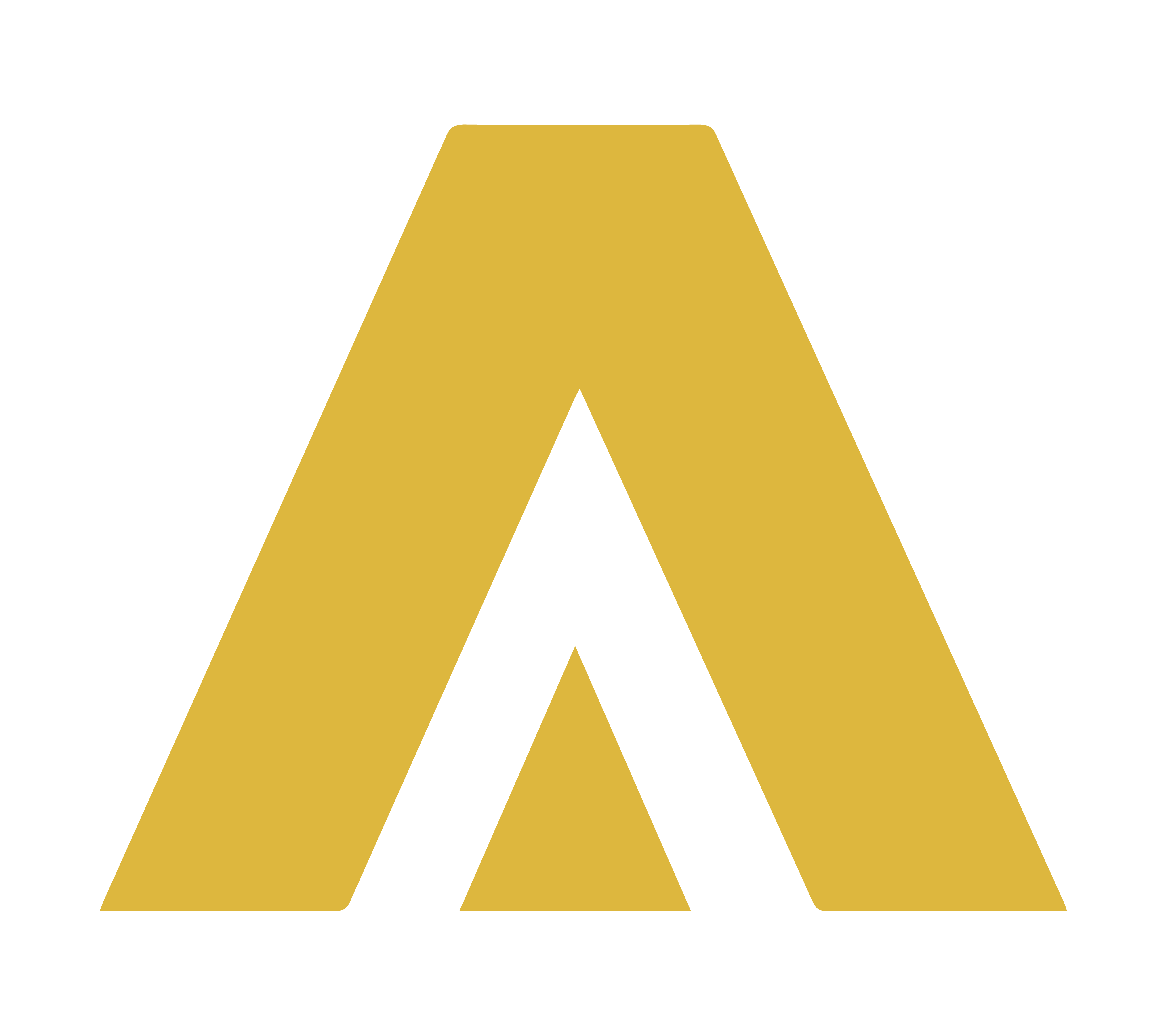
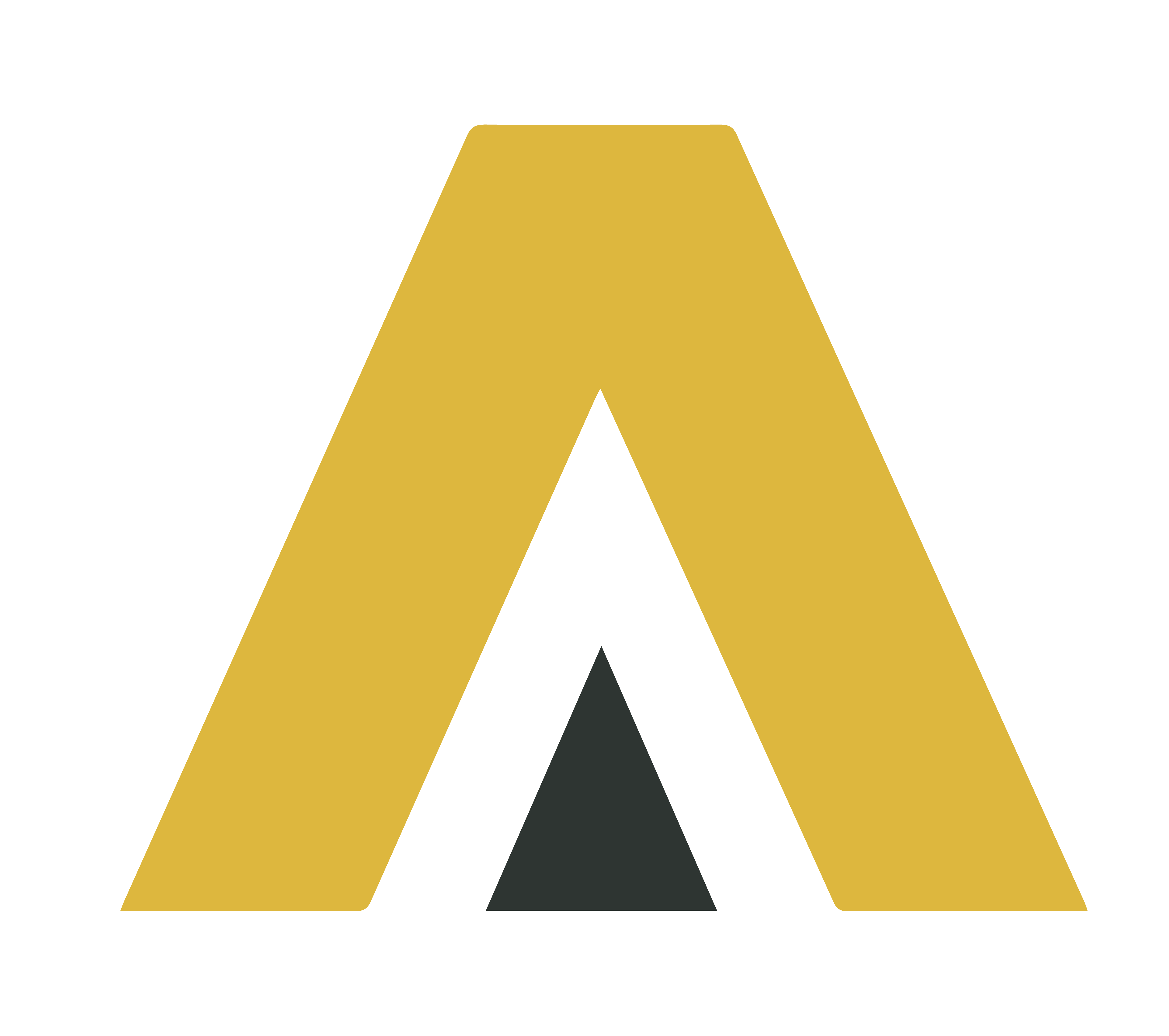
A peak you can stack.
The angular "A" emblem stands alone as an app icon, truck decal, or hard-hat sticker — a mountain of material in one mark.
Quarry gold, bedrock charcoal.
A two-color core — warm, premium gold against a grounded, industrial charcoal — backed by a full tint range.
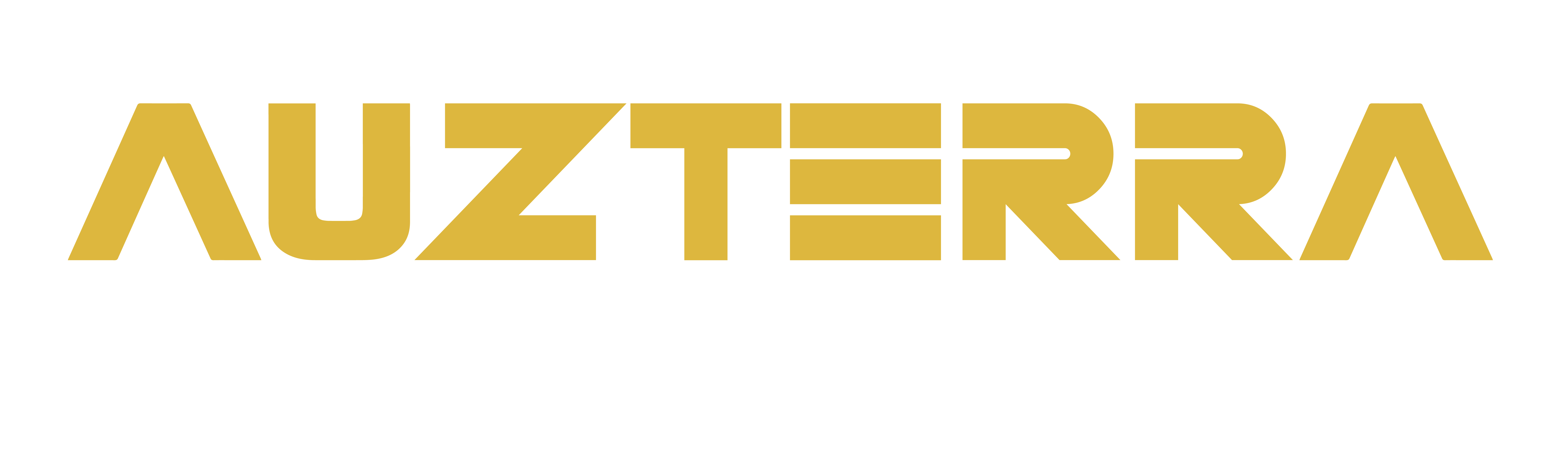
Heavy, squared, built to last.
Set in a bold, slightly squared sans for the wordmark — strong and machined, with a clean supporting face for body copy.
Then, we built the landing page.
A conversion-focused page that turns the new brand into quote requests.
A page built to win quotes.
Brand-consistent, mobile-first, and built around a clear path to a quote request.
From logo to launch.
- Custom wordmark with the angular peak "A"
- Standalone peak emblem for icons & decals
- Gold + charcoal color system with full tints
- Bold industrial type system
- Logo variations for light, dark & brand backgrounds
- Conversion-focused landing page with quote capture
Auzterra Aggregates launched with a bold, cohesive identity — a wordmark, emblem, color system, and landing page that look as dependable as the materials they supply.